I spend more time in the browser than anywhere else, building and styling sites. So I just want a browser that will help me, will be a usable tool that does what I ask of it (what we should ask of any tool really) and nothing more. I don’t think that’s unreasonable, so I made of list of common things I want in a browser.
I just want a browser that…
…is actively developed. (Chrome, Firefox, Edge, Safari, Brave, Vivaldi, Floorp, Zen, Orion, Dia, Atlas)
…with a mobile version. (Chrome, Firefox, Edge, Safari, Brave, Vivaldi, Floorp, Zen, Orion, Dia, Atlas)
…that doesn’t spy on me. (Chrome, Firefox, Edge, Safari, Brave, Vivaldi, Floorp, Zen, Orion, Dia, Atlas)
…that doesn’t have AI. (Chrome, Firefox, Edge, Safari, Brave, Vivaldi, Floorp, Zen, Orion, Dia, Atlas)
…that isn’t based on Chromium so the web continues to innovate. (Chrome, Firefox, Edge, Safari, Brave, Vivaldi, Floorp, Zen, Orion, Dia, Atlas)
…with a robust community of extensions. (Chrome, Firefox, Edge, Safari, Brave, Vivaldi, Floorp, Zen, Orion, Dia, Atlas)
…with usable dev tools. (Chrome, Firefox, Edge, Safari, Brave, Vivaldi, Floorp, Zen, Orion, Dia, Atlas)
The search for the right browser continues…
I’ve never seen such a obsequious embrace of technology by “geeks” as I have with AI. It feels like the entire tech world suddenly woke up one day and decided that not only should AI be the answer to everything, but that we all just have to be excited about it. That’s bullshit and reeks of insecurity to me.
It’s not that tech folks don’t go hard into the things they are into; we do. But typically, everyone stays into their own little niche, finds their community and is happy there. But with AI, it feels to me that nearly every person, from every corner of tech, just decided to jump into being unabashed AI cheerleaders, for no apparent reason other than “everyone else is into it”.
And the AI cheer squad seem to be genuinely stumped when you DON’T share their level of enthusiasm. As if not being into AI somehow hurts their ability to use it and enjoy it, like it makes it less than and that without unconditional support, it’s going to just disappear. It reminds me of street preachers, talking about the end of the world but that it can be stopped if only you will come to their church, believe what they believe.
I just don’t get it. There’s been Windows vs. Mac, Firefox vs. Chrome, React vs. Web Components, etc arguments forever and while everyone is passionate about their side, there’s always a grudging acceptance of the opposite view point (or at least a 🤷🏻♂️ and letting them do their own thing). And in tech, there is always that guy to turn around and say “Well actually…” about something, anything, that others are into. That’s how things get better, how software and hardware and design and UX and accessibility and art and music and general human experience gets better - by working together to find the problems and solving them.
But when you refuse to accept the problems, and just put on a big smile and pretend like nothing is wrong, nothing gets done and it makes things worse. But with AI, that discourse seems to be drowned out not by folks who have been proven right, but just by the folks who are the loudest and they want you to join the cacophony of their noise.
People who are insecure about their beliefs, and know deep down that they may be wrong, act like this. That if you try to poke holes in their beliefs, it’s all going to come crashing down so we just have to hurry up and get everyone on board, and finally then, when there is no one left to convert, will they be proven right. (I’ll let you draw your own comparisons between AI and religion).
I don’t want AI. I don’t want it in my tools, in my browser, in my day to day life. I’m happy for you that you like it, great, go ahead and enjoy. But leave me the fuck alone and stop trying to convert me and we’ll see who is proven right in the long run.
(And if you aren’t one of those AI cheerleaders, then welcome to the resistance. We have cookies and punch on the back table.)
This week, while on a lull between starting projects at work, I decided to check back in on the latest Bluesky drama (because there is always Bluesky drama). I setup an account a while ago and set all my previous follows from Twitter but due to just running out of free time, neglected reading it in favor of Mastodon and my RSS feed.
The official Bluesky app was a no go for me because of its data tracking, and most of the other 3rd party apps that I had tried like Gray Sky, seemed wonky so I instead repurposed the amazing Tapestry app from Icon Factory to just be a Bluesky reader since I prefer Lire for RSS, though Tapestry can do RSS too.
Once it had re-synced up to the latest timeline, I left it open for a bit, did some stuff and then clicked back into it. Holy shit, 200+ posts in under an hour. I follow 111 accounts on Bluesky and probably half are news orgs and sports writers but that seemed ridiculous.
On Mastodon, I follow 218 accounts but on a day where I don’t check it at all, I MIGHT pass 250 posts. There is some overlap in accounts/posts between the two services but besides the sheer number, the actual constant flow from Bluesky made me anxious.
It felt like I can’t keep up with it, that when I got to the top I could pull to refresh and another 40 would be waiting on me. When reading Mastodon, I never feel this. I think this is because while Mastodon is about 1/8 the size of Bluesky, it isn’t a breaking news platform really, nor one where you get a ton of shit posts. That’s by design and one of the things I really enjoy, the (mostly) thoughtfulness of it.
Mastodon is like walking into a large dinner party with a few different conversations happening you can walk up to. Bluesky is like being in a stadium full of yelling, screaming people generally talking about the same thing but from 6 different angles. It makes your head spin.
I loved the original Twitter before it became a Nazi bar and never minded the fire hose effect then. Bluesky seems to have a Twitter circa 2013 vibe to it now, with a lot of conversations and a lot of voices and more posts than you can keep up with and for a lot of folks, that’s the draw (especially if you’re liberal).
But maybe because I stepped away and got comfy with Mastodon, coming back to Bluesky just seems like too much. I can feel my anxiousness rise and those (totally unhealthy) dopamine hits of being “caught up” trickling back.
I don’t think I can go back to Bluesky long term now. My brain just can’t handle it. I’ll still check it every now and then, scroll to see what’s going on when bored or something, but making it part of my online diet? Those days have passed for me.
Inspired by my former coworker and great friend Aubrey over on her blog (who was also inspired by her friend B), I’m finally willing to acknowledge that this blog needs more posts and I should blog more.
Every blog post doesn’t have to be a big Think Piece (which is what I tried for in the past), blogging is sometimes best when it’s just random missives here and there about whatever is going on in your life at the moment. I use Micro.blog for blogging and their vision for blogs is right there in the name - micro. Hell, you have to get to over 300 characters on it before you can even add a title to your post!
So I’m going to try (every blogger’s famous last words, hah) to be more casual about posts here, and post more often. Not for clicks, not for attention but to do my part to contribute back to the old internet I miss. The days of LiveJournal and GeoCities and indy blogs.
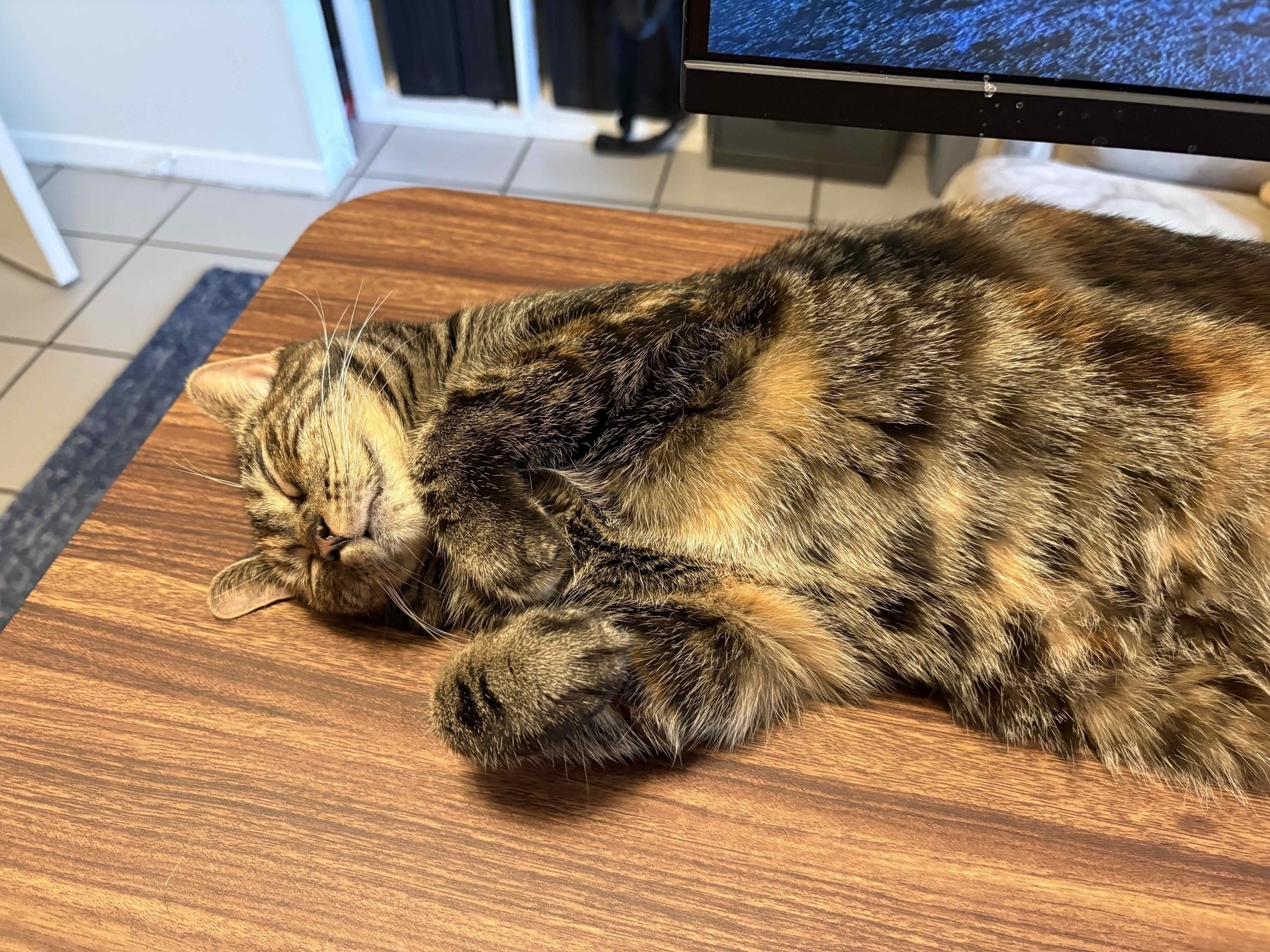
And in honor of that, here’s a cute picture of my cat Tina. Because all good blogs should have a cat picture.
As a web developer who spends 40+ hours a week building sites for someone else, I know I am not alone in finding it difficult to muster up the motivation to build something for yourself. Sometimes, the last thing I want to do is stay at the keyboard and redesign my own site, because I know all the work that usually entails. And so it becomes an exercise in “I’ll get to it soon” and “soon” becomes weeks, then months, then years, until you finally get so tired of looking at your previous site that you can’t take it anymore and need to just get it done.
In my nearly 30 years of building sites, I’ve picked up plenty of technical know how along the way on how to build a site, but when you are doing it for yourself, you are your worst client and your harshest critic. So when I sat down to rebuild varn.dev I did my best to put all of those thoughts out of my head and just do something that I felt I would enjoy visiting, would spark a little bit of joy or a smile if I were a random visitor while still looking halfway decent.
It’s that spark of joy that I was really focusing on with this redesign. The web can still surprise and amaze after all of these years, and that thrill of discovering something that makes you smile, or makes you want to come back or learn more about the author, is such a unique and special feeling. It’s a way to see someone’s true self, only in digital form. Even though I was really only building for an audience of one, I still wanted folks who came across it to maybe enjoy finding little “easter eggs” or something fun or neat on it before clicking away.
The first thing that came to mind with doing something fun, was some sort of interactive element but not so glaring that you were overwhelmed by it. Because of my affinity for Galaga (see the home page), I settled on making one of the ships blow up like in the classic video game. But finding a way to do that proved to be a challenge. I provide credit on my about page but I essentially found the sprites used in the game and then, manually, edited them down to be transparent so it would work on my background.
Then, using ezgif.com and watching a ton of Youtube videos to get the exact timing right, I made a GIF of the main “Galaga” ship moving in it’s usual pattern, then repeated the process for the second shot of the ship (in the game, to blow up these “boss” ships, you have to shoot them twice). The explosion part was a lot more time consuming but was created the same way. Then, using just plain old Javascript, I set the ship as the background of a button (for accessibility) and had it’s background change on click, then change again when clicked a second time. After the two clicks, I wanted users to be able to do it as much as they want, so I reset the loop and had it fly back down, so you could blow it up all over again. If at this point you have no idea what I’m talking about, click/touch the moving green ship up in the header next to the logo, once and then twice, to see it in action.
The exploding ship without context would be sorta weird, so the idea started to really snow ball. I found a pixel background Codepen through some searching, and modified it to look more like the actual game background. It doesn’t scroll and move down the page like in the actual game, but that’s ok because that would probably be a bit much. The twinkling effect was good enough for me!
On the home page of the site, I needed a little more to continue the idea, so I repeated the process of making GIFs of some of the ships and had them fly in before settling into the actual pattern in the game, where they just move slowly back and forth before you blow them up. This was a bit of a headache to get right in terms of the sliding in, due to animating them for different breakpoints. As of this writing, I’m not 100% happy with it and how they position themselves, so I may revisit and tweak this more. If it looks smooth to you on the home page then you know I was successful!
But animations are all good and fine for a “make you smile” sort of thing, but for users who don’t like motion, it can be overwhelming, even if they are subtle. As I am a huge proponent of accessibility in all things on the web, I wanted to give users the option to disable them by default or, if their system had it set already, to turn them off when they get there. I had never built an animation toggle, but it proved pretty straightforward with a little bit of Javascript and CSS class swapping.
Continuing down that path, I also know not everyone likes a dark mode for a website, even though I dark mode all the things! So I added a toggle for switching light/dark mode, using the new-ish light-dark property in CSS as well as a bit of Javascript to detect the user’s preference. I found an incredibly helpful post by Salma Alam-Naylor on dev.to that outlines how to do this with some JS and CSS variables, and now my toggles were set! The only drawback to the color toggling was the ship animations. With the color I chose for the light mode, the colors of the ships themselves just looked garish and were way too bright. Rather than remaking the GIFs in a new color palette, I opted to just keep them as they were and apply a CSS filter to give them a solid color overlay. It’s not exact and is different than what I intended, but the idea behind them still comes across fine in my opinion and hopefully all you light mode folks agree.
This blog is hosted on micro.blog and always has been, but it always looked different than the original version because I use Micro.blog so I can have a quick and easy way to write a blog post without building a whole CMS or build process for it. The old design of it looked…not great…in comparison to what I was shooting for with this site, so I took the time to delve into their templating system, which uses Hugo to make it match the look of the rest of my site.
The only unfortunate side of doing this is that due to the way the asset management works on Micro.blog, it would have been tricky to include background images and my JS for the same, seamless look, directly in the system without linking out. While it’s not my preferred way of doing it, I had to hardcode all the full paths in for images and the CSS/JS for the site within the template system, rather than let it get served locally. It’s not the end of the world, but additional page requests are always a bummer for performance. The plus side is that a change on the main site updates the blog as well, so I can live with the trade-off for now.
The other tough part about doing a personal site is the actual content. I wanted it to show who I was, but writing about yourself (or showcasing yourself) can feel a bit icky at times. When I worked for myself, I had a portfolio as a way to show “Hey I know what I’m doing”, but when you work for an agency that is a bit disingenuous. So I kept it simple, sticking with an about page with my basic background, and a uses page because I’m always fascinated to see how people work and the tools they use, and know that I’m not alone in that.
Finally, since I work primarily in Drupal professionally, I have sort of missed the static-site generator revolution (the previous version of my site was literally just hand coded HTML) but wanted to push myself a bit more and add a build process for the site. After speaking with fellow dev friends, and a bit of an assist from my former co-worker Aubrey Sambor, I settled on and got up and running stupid-quick with 11ty. Seriously, I had no idea how fast a build process could run and how easy it is to get going. Yes, I know that these have been around for years now but I’m still playing catch up with some technologies if I don’t have a day to day use for them. Welcome to the 2020’s Adam, lol.
So that’s it. After finding the motivation to build a new look for my site (and having some free time between work projects), varn.dev is ready to go and looks how I envisioned it. Along the way, I learned some neat CSS and JS stuff (the animation and light-dark toggling) and caught up to modern times with a static site generator (finally). I hope that some of this site makes you smile or sparks a little joy in visiting, because it does for me and I really enjoyed stretching myself to learn new things, even if it was just for my own edification.
Just don’t ask me to redo my site again for a while.